

One of the challenges of the digital world, compared to other sectors, is that we have so much data to pick from when analyzing our program’s health. We’re drowning in data. You could spend all day running reports and doing analyses – but unless your organization is large enough and complex enough to have its own analytics team, you probably don’t have time to do that. And more data isn’t necessarily better data.
The trick is to effective reporting is to track and use your data smartly: to have the metrics you need, when you need them, but no more than that. It also helps to simplify your processes, so you’re spending more time using that data to inform your work, rather than sinking your effort into pulling and manipulating it. You want different levels of reporting, each tailored to specific, goal-oriented purposes.
There are three levels of reporting that I find useful for most non-profit digital programs:
Your Dashboard
When you’re driving, you need to certain information about how your car is doing right now. Your dashboard tells you how fast you’re going, how hard your engine is working, and whether your headlights are on. It’ll warn you if something is dangerously broken. But it won’t tell you everything – just what you need right now, and the most important data, like speed, is front and center.

A good digital dashboard is the same way: clear enough to let you know how you’re doing at the moment, and detailed enough to flag problems, but not all-encompassing. It should include all your major channels and goals, but still be simple and easy to manage.
One key to a successful dashboard is ease of updating. In my experience, the most common reason organizations fail to look at their data on a regular basis is that time-consuming, non-critical tasks like reporting often fall by the wayside. If that’s the case at your organization, look for ways to make your dashboard as easy as possible for staff to manage, and show them the importance of keeping it up to date. Ideally, it should take about 30-60 minutes each time you update it, so it’s not a chore. But creating a culture of appreciating and using good data is also essential for making the dashboard useful.
There are two main approaches to an easily-maintained dashboard: a manual one, usually in a spreadsheet like Excel, and an automated dashboard.
If you’re using a spreadsheet for your dashboard, here are a few tips:
- Decide how often you want to update the dashboard. Weekly? Monthly?
- Make it one person’s responsibility to keep it updated.
- Limit your dashboard to the areas of your work that matter most, or where it’s most important to track trends.
- Include only data points that are easy to pull from reports (setting up custom reports if necessary), and schedule them to run when you need them.
- Format your dashboard so it’s easy to download, copy, and paste in data from all your data sources.
An alternative to the spreadsheet-based dashboard is the automated digital dashboard. I’m increasingly excited about the capabilities of tools like Google Data Studio, Klipfolio, and DataBox (among many others) to provide an always-updated, consistent, API-driven view of the key metrics from all of your digital platforms.
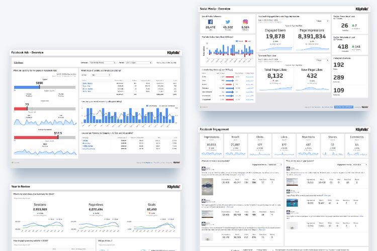
Here’s what these dashboard can look like in one such tool, Klipfolio:
These dashboard tools take more up-front effort than a spreadsheet, and setting them up may take some technical skills. The data you can include may be limited by the capabilities of the digital platforms you use – some platforms have much more robust reporting APIs than others. Before you invest in building an automated dashboard, check to see if all the tools where you have critical data are compatible. But if it works for your needs, digital dashboards can have big benefits: your data will be there, up-to-date, whenever you need it, all in one place. And after the initial set-up, it will take minimal effort to maintain, which means no more monthly reporting chores for your team.
Whatever kind of dashboard you create, though, it will only give you part of the picture. You also need:
Your Tune-Up
Periodically, your car needs a look under the hood. A regular tune-up will check the things that don’t show up on your dashboard, or that only show up when something is broken – things that most drivers won’t check during the day-to-day use of your car. You don’t need to check your oil every day, but you do need regular oil changes.

Your digital data is the same way. Some data points are too time-consuming to include in a dashboard, or because they change so slowly, it’s not worth the effort of constantly keeping them updated. But they still need review, on occasion, to check on your program’s health. It’s useful to have a certain set of analyses you run on a quarterly, biannual, or annual basis, to track this data consistently over time. These “tune-up” analyses will vary depending on your organization’s priorities, but might include:
- Your average online gift amount
- The length of an average sustaining gift
- Typical email performance metrics, and how they compare to benchmarks
Where a dashboard helps you track current performance and identify red flags that need addressing, a tune-up is an opportunity to look at longer-term trends and make course corrections to improve your program’s performance.
Your Deeper Dive
A tune-up won’t catch everything. With a car, you probably only need your mechanic to go beyond the tune-up if something is obviously wrong, like “why is my car making this terrible noise?” Your mechanic may need to take the car apart and look at all its pieces to find and fix the problem.

In your digital program data, a deeper dive could be helpful if you see a cause for concern, like a downward trend in online fundraising, in your dashboard or tune-up analysis. But deeper analysis can also help identify areas for growth, where your program is strong already but may not be living up to its full potential. In these cases, you’ll want to look more deeply at your program health:
- Who is engaging with your digital content? In what ways?
- How is donor behavior different than non-donor behavior? Who is most likely to donate?
- What patterns do you see in donations over time?
- What tactics have been most effective, and which ones aren’t worth the effort?
- Where have you seen good results and could be doing more?
Such a deep dive is too labor-intensive to do all the time, unless your organization is large enough to have its own analytics staff, but it can be immensely valuable to set aside time or budget for more extensive performance analysis. Another time when this can be beneficial is during a change in organizational direction, like when entering a rebrand or a website redesign. That way, you’ll have full insight into your current performance to inform your new direction.
Alone, none of these three levels of reporting gets you the full picture of your program’s performance. But when they work together, using your dashboard for current status, your tune-ups for more detailed analysis, and your deeper dives for data-driven insight, you’ll always have the information you need. And you’ll get it efficiently, balancing your time and effort with the need for insight into your performance to help you make effective, data-driven decisions.